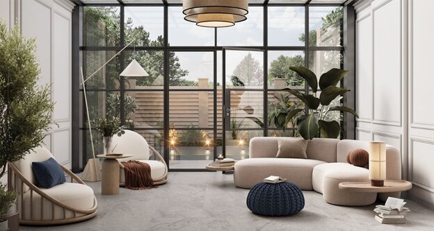
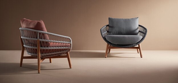
A Beginner’s Guide to Mixing Woods, Metals, and Materials in Interior Design
There is a quiet moment in every beautifully designed room when you pause — almost involuntarily — and think, Why does this space feel so harmonious? You may not consciously register the design details, but your eyes glide comfortably across the room. Nothing feels jarring. Nothing feels too heavy or too flat. Everything seems to connect.
That feeling often comes from material harmony — the way woods, metals, stones, fabrics, and finishes interact with one another.
Material harmony is one of the trickiest aspects of interior design. You might know that you love the look of walnut wood, or brass accents, or marble surfaces — but the fear of “mixing things wrong” stops you from experimenting. Yet when you study high-end interiors around the world, the spaces that feel the most expensive almost always mix materials… just very intentionally.
Here is the guide that demystifies this art form.
Material Mixing Isn’t About Matching — It’s About Balance
One of the biggest misconceptions in design is that everything must match. In reality, matching creates monotony. Rooms full of the same wood tone or the same metal finish feel flat and predictable. Good design — truly memorable design — has contrast, depth, and layered texture.
Instead of matching everything, think of materials like characters in a story. Each one has a role:
- Woods add warmth and grounding.
- Metals add shine and energy.
- Stone adds permanence and luxury.
- Fabric adds softness and human touch.
- Glass adds airiness and flow.
A beautiful room blends characters that complement one another, each adding something essential.
Fun fact: Neuroscience research shows that humans are drawn to environments with a mixture of soft and hard textures — it signals both comfort and structure. This is why mixed-material spaces feel more satisfying to be in.
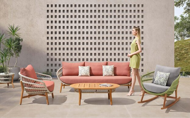
Let’s Begin With Woods: The Foundation of Warmth
Woods anchor the room. Their tones shape how warm, cool, traditional, or modern a space feels.
There are three broad wood families you’ll encounter:
a. Light Woods
Ash, oak, maple, birch. These feel Scandinavian, airy, youthful. They brighten a space.
b. Mid-tone Woods
Teak, walnut, elm. Warm, timeless, and universally flattering. These woods feel rich but approachable.
c. Dark Woods
Mahogany, ebony, dark walnut. Dramatic, elegant, and often used in boutique hotel interiors.
The secret to mixing woods
Instead of trying to match them, look for the undertone:
- Some woods have yellow undertones.
- Some lean towards red.
- Others feel grey or neutral.
If the undertones harmonise, the mix will look intentional.
For example:
- Oak (light, golden) pairs beautifully with walnut (medium, golden-brown).
- Ash (pale, neutral) pairs well with blackened wood (deep, cool).
- Teak (warm, orange undertone) pairs well with darker woods that share warmth.
Pro tip: Use one dominant wood tone, one supporting wood tone, and keep other wood accents minimal.
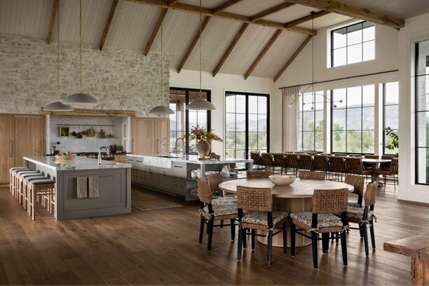
Metals: The Jewelry of the Room
Just as jewelry completes an outfit, metals complete a room. You don’t have to stick to a single finish — in fact, most designer spaces mix two or three.
Metals generally fall into three categories:
a. Warm Metals
Brass, gold, bronze. These add warmth and luxury.
b. Cool Metals
Chrome, silver, stainless steel. These add modernity and clarity.
c. Dark Metals
Blackened steel, graphite, matte black. These add edge and sophistication.
How to mix metals like a designer
Think of metals as accents rather than dominant elements. Choose one metal as your “lead,” and let others play supporting roles.
For example:
- Lead: Brushed gold
- Supporting: Black accents
- Occasional highlight: Polished silver
Or:
- Lead: Black metal
- Supporting: Brushed brass
- Highlight: Copper or rose gold in small doses
Pro Tip: In hospitality design, brass and black are the most common pairing because brass adds warmth while black grounds the space.
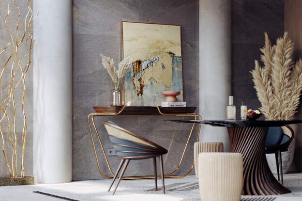
Stone: The Anchor of Elegance
Stone is a statement material. Whether it’s marble, travertine, terrazzo, or ceramic stone, it carries a natural sophistication. Stone’s visual weight makes it perfect for:
- Dining tables
- Coffee tables
- Sideboards
- Kitchen counters
- Shelving
- Decorative objects
Choosing stones that complement your woods and metals
- Warm stones (crema, travertine, honey onyx) pair beautifully with brass and walnut.
- Cool stones (white marble, grey limestone) pair well with black metal and oak.
- Dramatic stones (green marble, Portoro black-gold) want minimalist surroundings to shine.
Balance stone with softer materials
Stone is visually heavy. To soften its look, pair it with:
- Soft ceramics
- Linen upholstery
- Textured rugs
- Warm lighting
This combination creates what designers call “comfortable luxury.”
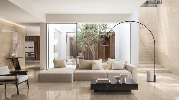
Fabrics: The Soft Architecture of the Room
Fabrics influence tone more than people realise. A sofa in bouclé feels completely different from the same sofa in leather. A chair in velvet changes the emotional temperature of the room instantly.
Know your fabric categories
- Bouclé → cozy, cloud-like texture
- Chenille → soft luxury
- Linen blends → airy and relaxed
- Velvet → glamorous and moody
- Leather → timeless richness
- Performance fabrics → durable for families
Mix textures like you mix flavours
Combining textures brings a sense of layered comfort:
- Linen sofa + leather accents
- Velvet cushions + marble coffee table
- Bouclé chair + black metal legs
Texture mixing is one of the easiest ways to make a home look professionally styled.
Pro tip: Use at least three textures in every room — one smooth, one soft, one structured.
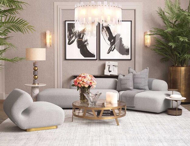
Glass: The Invisible Balancer
Glass is often overlooked because it seems “neutral.” But glass plays an essential role — it opens up visual space and prevents heavier materials from overwhelming the room.
Use it in:
- Coffee tables
- Shelving
- Pendant lights
- Tabletop décor
Glass blends beautifully with every other material because it reflects and enhances its surroundings.
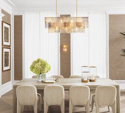
How Designers Choose Their Mix: The 60/30/10 Formula
Here’s a practical, insider trick interior designers use:
● 60% Primary Material
● 30% Secondary Material
● 10% Accent Material
Let’s apply it:
Example 1 — Quiet Luxury Living Room:
- 60% → Soft oak wood
- 30% → Textured fabrics (linen, bouclé)
- 10% → Brushed brass
Example 2 — Modern Contemporary Dining Space:
- 60% → Matte black steel + neutral fabrics
- 30% → Walnut
- 10% → Marble + chrome details
This formula ensures balance and cohesion.
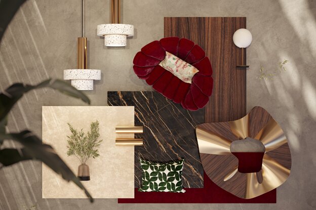
Another Design Secret: Repeat Each Material At Least Twice
One marble object is an accident. Two marble objects is a theme. Three creates cohesion.
A black metal floor lamp looks disjointed — unless you repeat black in:
- Your chair legs
- Your picture frames
- Or your shelving.
Repetition creates visual memory. Your mind begins to connect the dots.
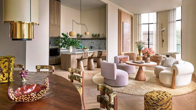
Where to Mix Materials — And Where to Keep It Simple
Some rooms benefit from material richness; others thrive on simplicity.
Spaces to mix materials boldly:
- The living room (texture layering)
- Dining room (wood + stone + metal)
- Home office (wood + fabric + metal)
Spaces to keep simpler:
- Bedrooms (too many materials disrupt rest)
- Small entryways (visual clutter looks overwhelming)
- Minimalist interiors (simplicity is the intention)
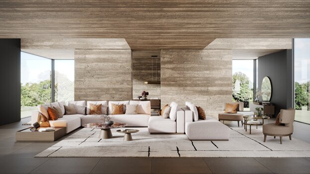
Lighting Changes How Materials Look
The same wood can look golden under warm lighting and grey under cool lighting.
This is why premium furniture showrooms use warm, diffused lighting to enhance grain texture, metal warmth, stone depth, and fabric softness.
When mixing materials at home, always remember to observe them at night as well as during the day.
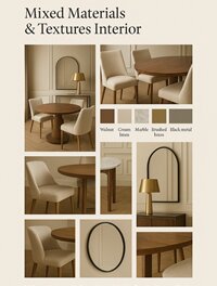
Case Study: A Melandas Client Transformation
A client once came in with a common dilemma: “I love walnut, marble, and gold — but I’m afraid my home will look mismatched.”
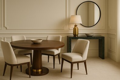
After choosing the right undertones and proportions, the result was breathtaking:
- Walnut dining table
- Soft cream linen chairs
- Marble console
- Brushed brass lamp
- Black metal mirror frame
The mix felt intentional, luxurious, and cohesive — proof that the magic is in the balance, not the matching.
Good Material Mixing Doesn’t Follow Strict Rules — It Follows Feeling
Interior design is part science, part intuition. You want the room to feel grounded, warm, and visually connected.
If a material feels out of place, it probably is. If a combination instantly delights you, even if unconventional, it’s probably right.
Your home should look beautiful — but more importantly, it should feel beautiful.
If you’re feeling inspired to explore material combinations that elevate your home, we encourage you to browse through Melandas’ large collection of furniture and decorative items on our website. Discover curated pieces in wood, metal, stone, and luxury fabrics — and start building a space that feels harmonious, intentional, and beautifully yours.